Apple


2014
Huge Inc.
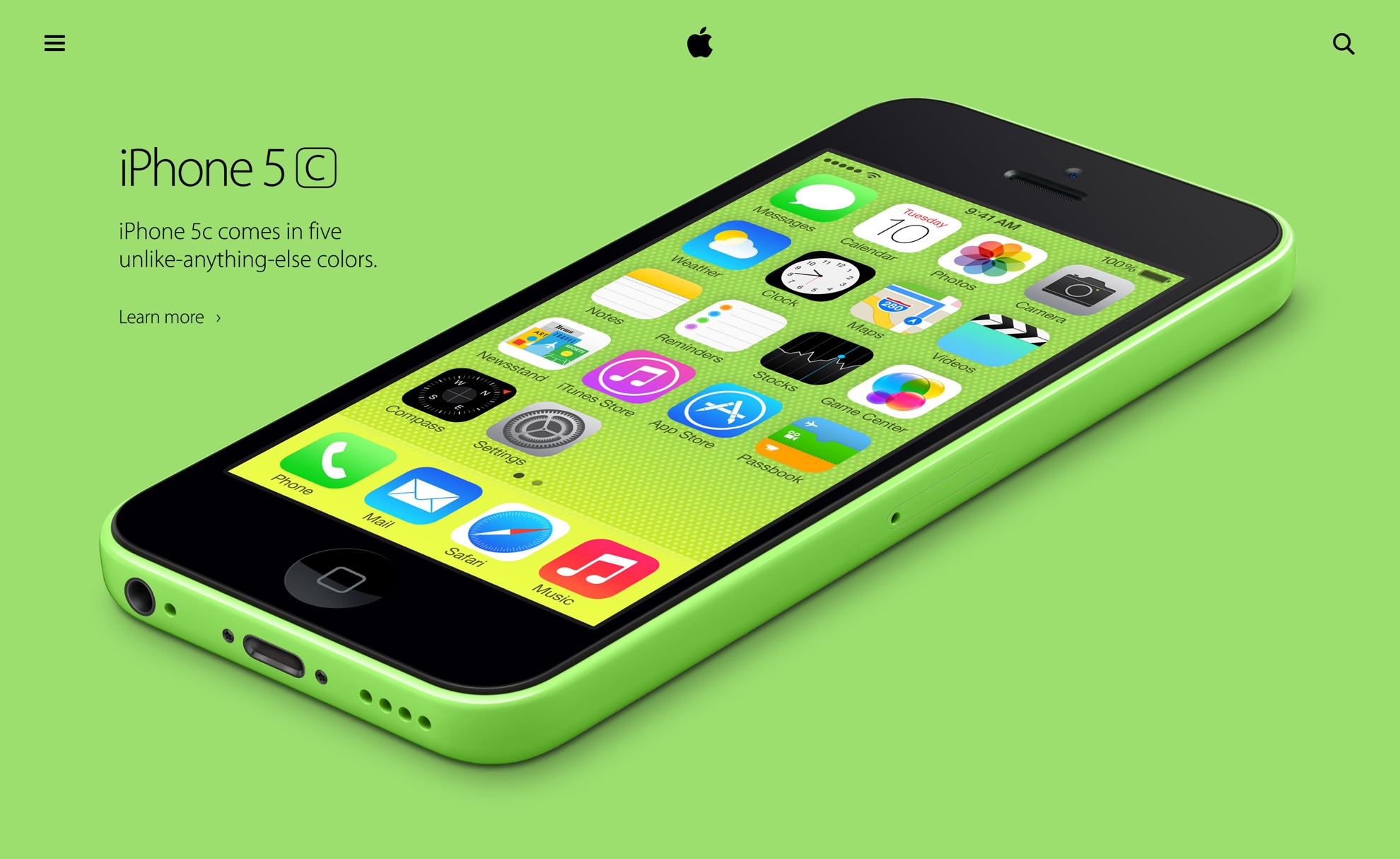
Apple Website Redesign
In 2014, I was part of the first team Huge sent to work at Apple in their San Francisco HQ. At first, we had only three visual designers and three UX designers coming from our Huge offices around the world, so we had the chance to work very closely with the Apple creative leadership. We were challenged to push the design boundaries and explore blue-sky concepts for their website redesign, from Art Direction to robust UX solutions and unique navigational paradigms.
Direction 1: Swiss
This first design direction was heavily influenced by the timeless Swiss design movement, and borrowed from classical graphic design principles originally developed for print design. Josef Müller-Brockmann, Jan Tschichold, and Massimo Vignelli were some of the biggest influences for this design direction.
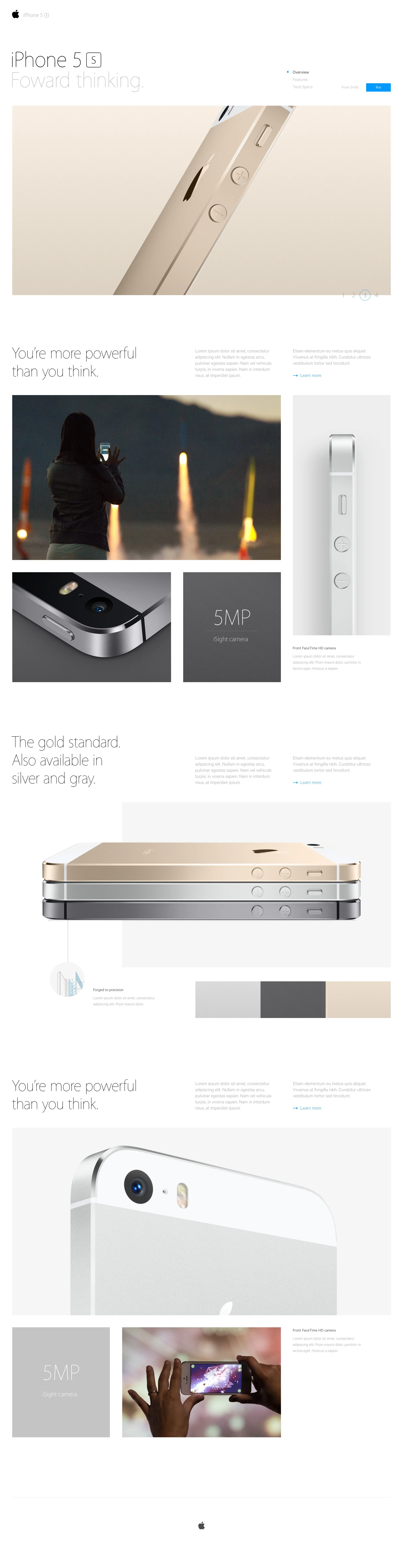

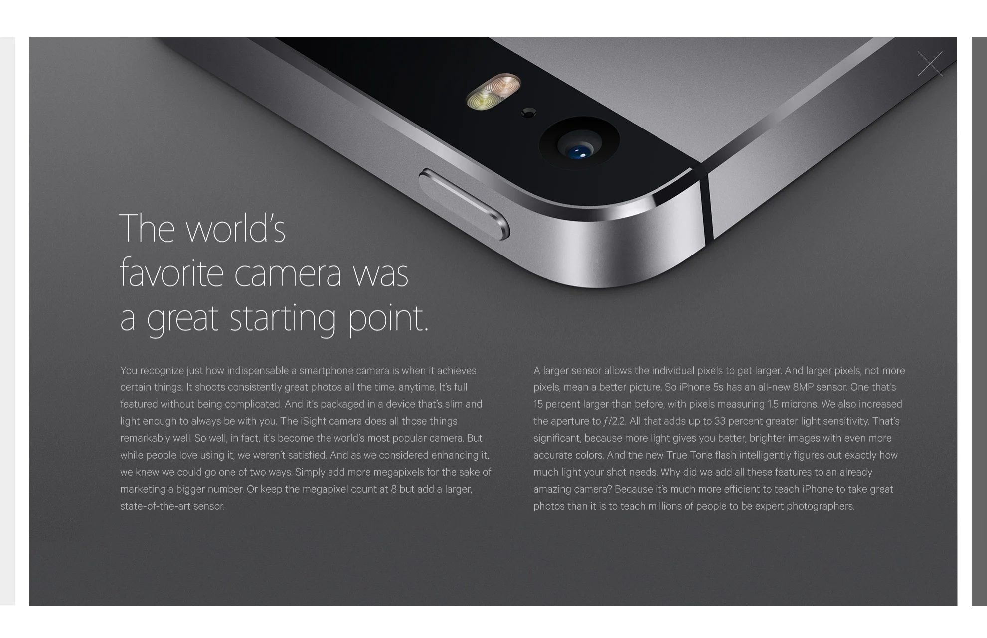
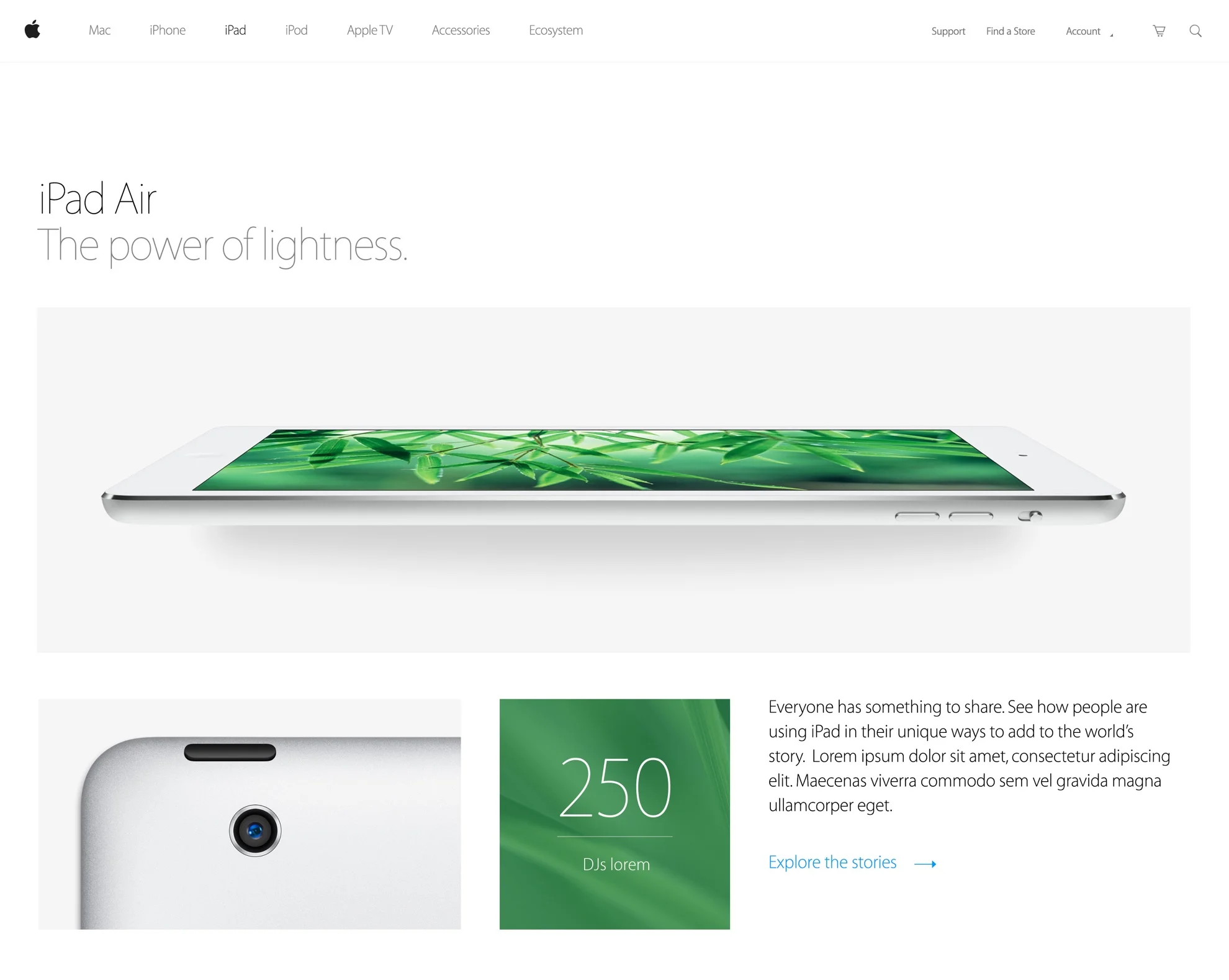
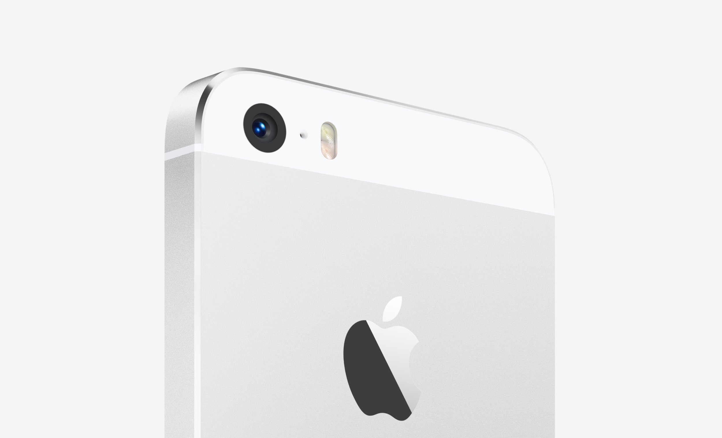
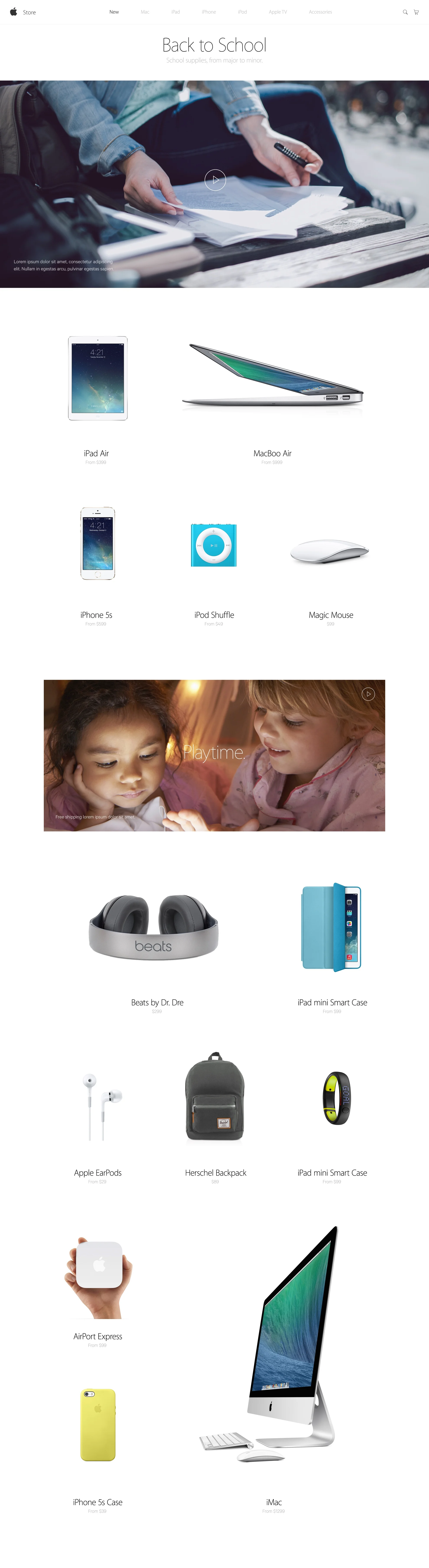
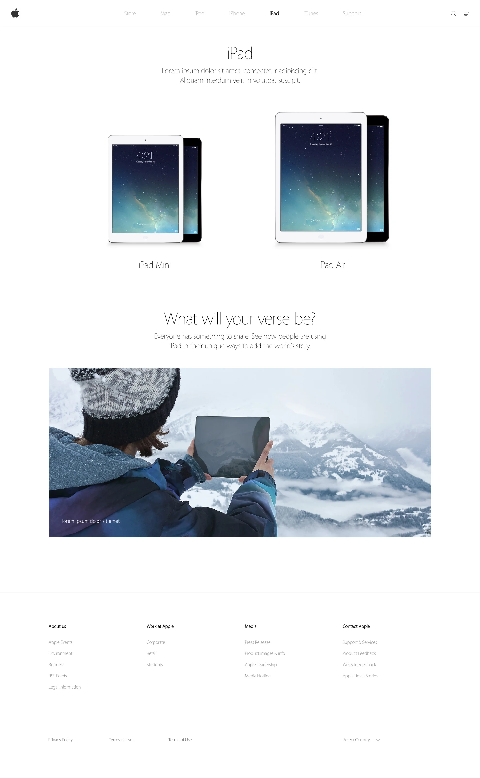
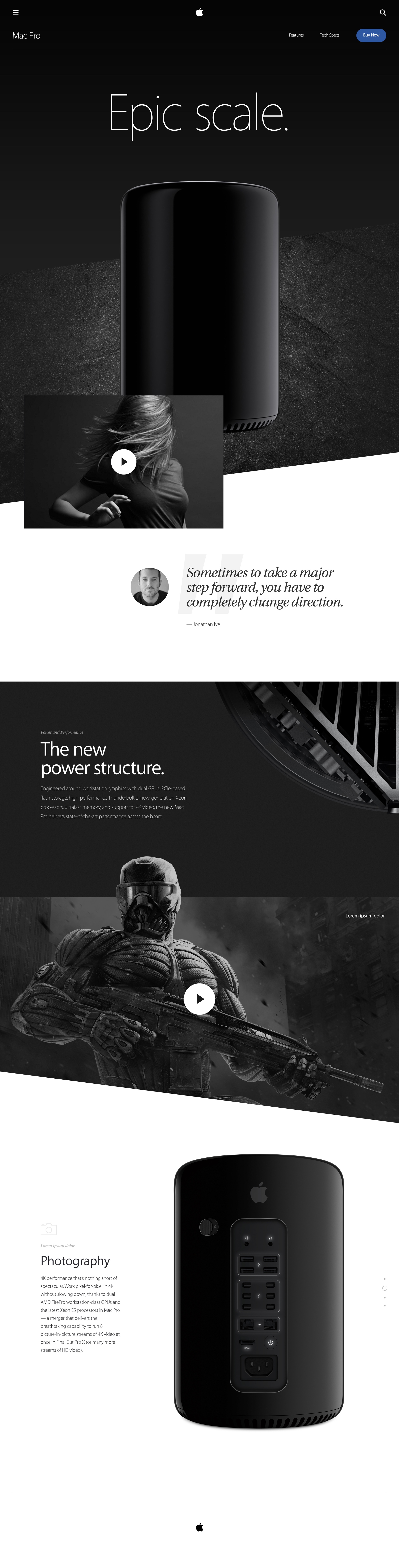
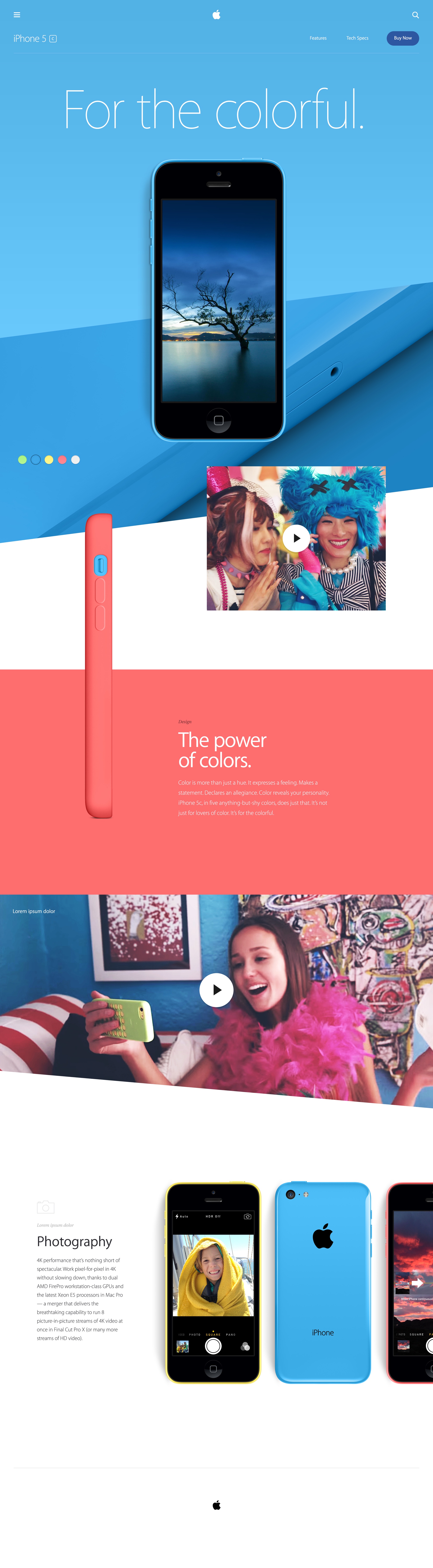
Direction 2: Grid
This nice and simple direction featured heavily gridded designs, blocked content, along with thoughtful use of videos, animations, and transitions, all in order to add depth and dynamism to a more rigid visual structure.
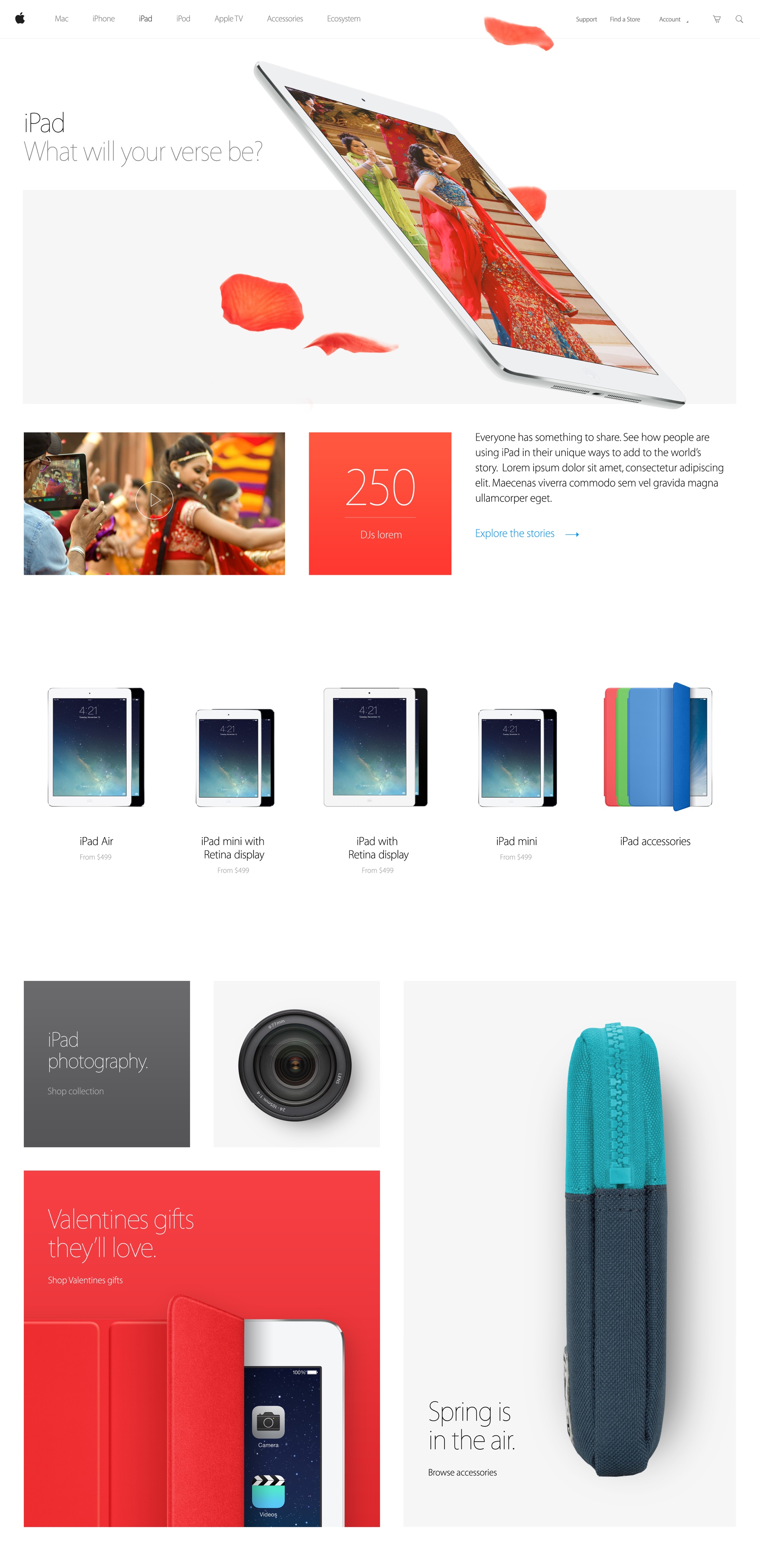
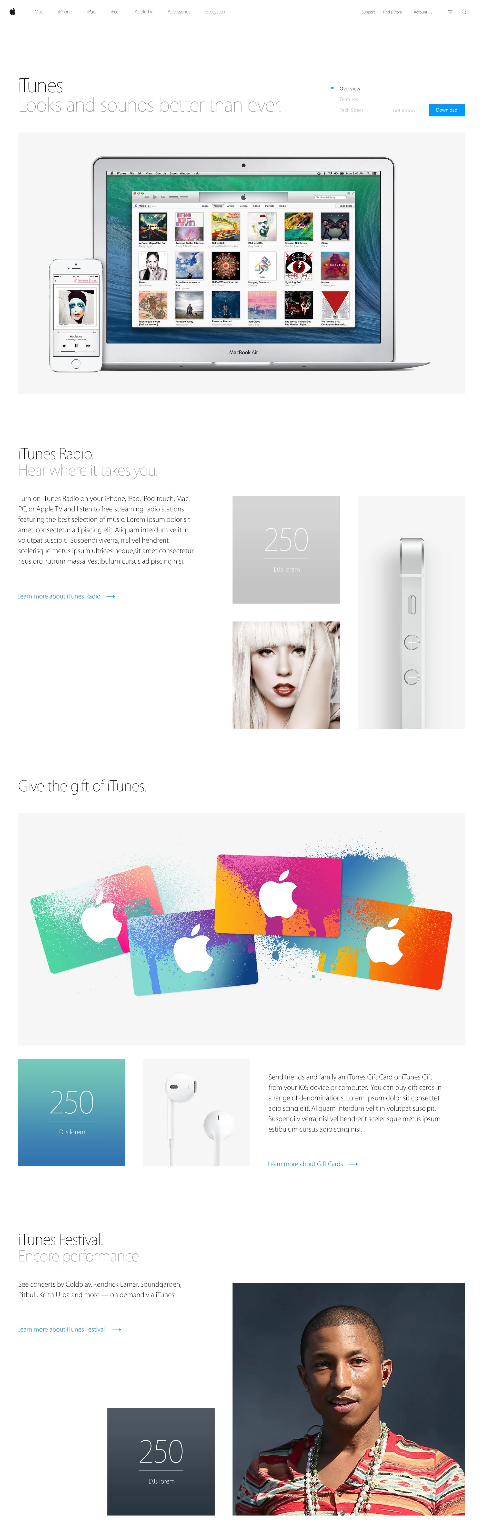
Campaigns
We explored many ways of integrating campaign content (ads, video testimonials, etc.) into the more evergreen product detail pages (iPad, Mac Book, etc.).
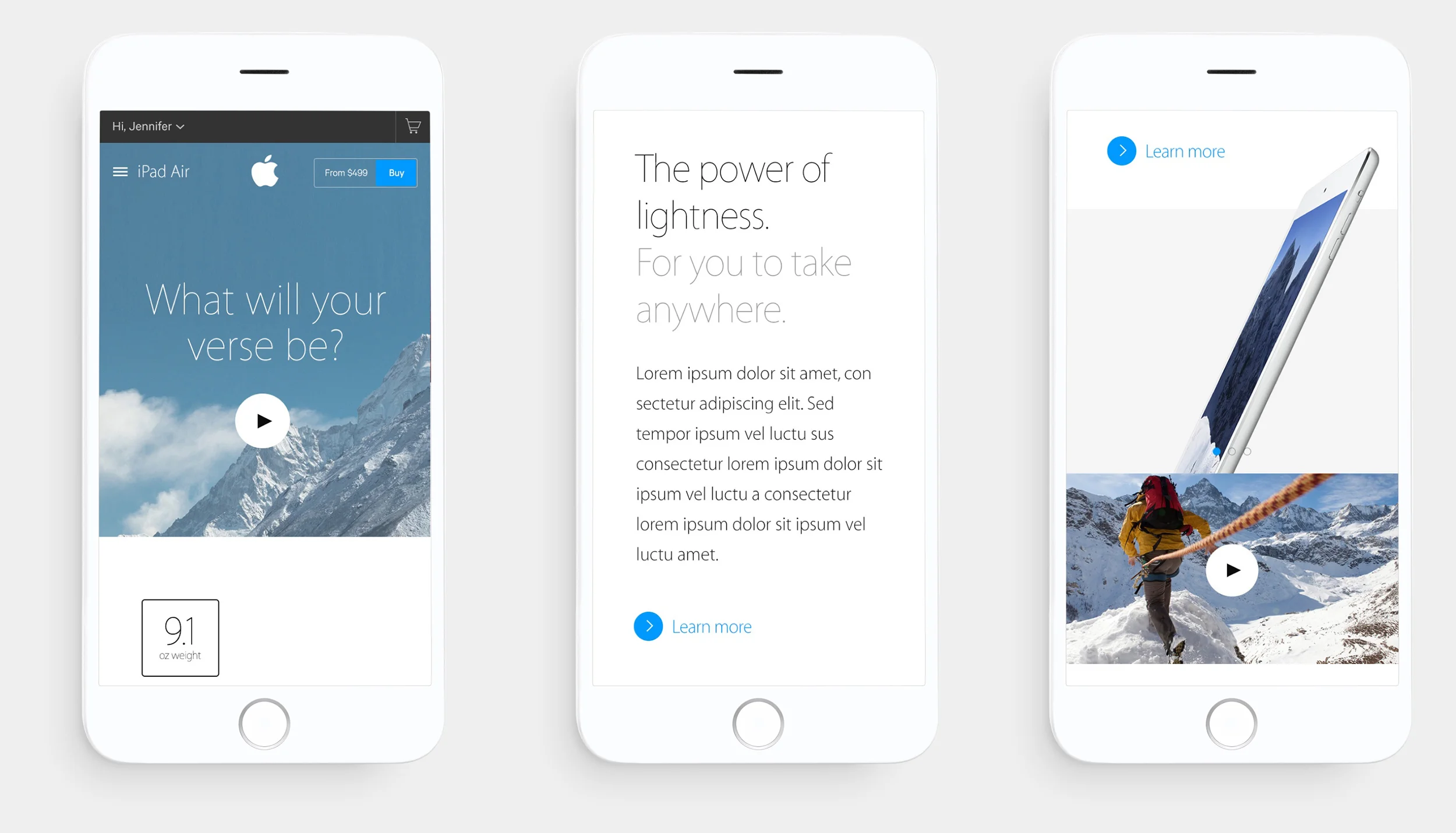
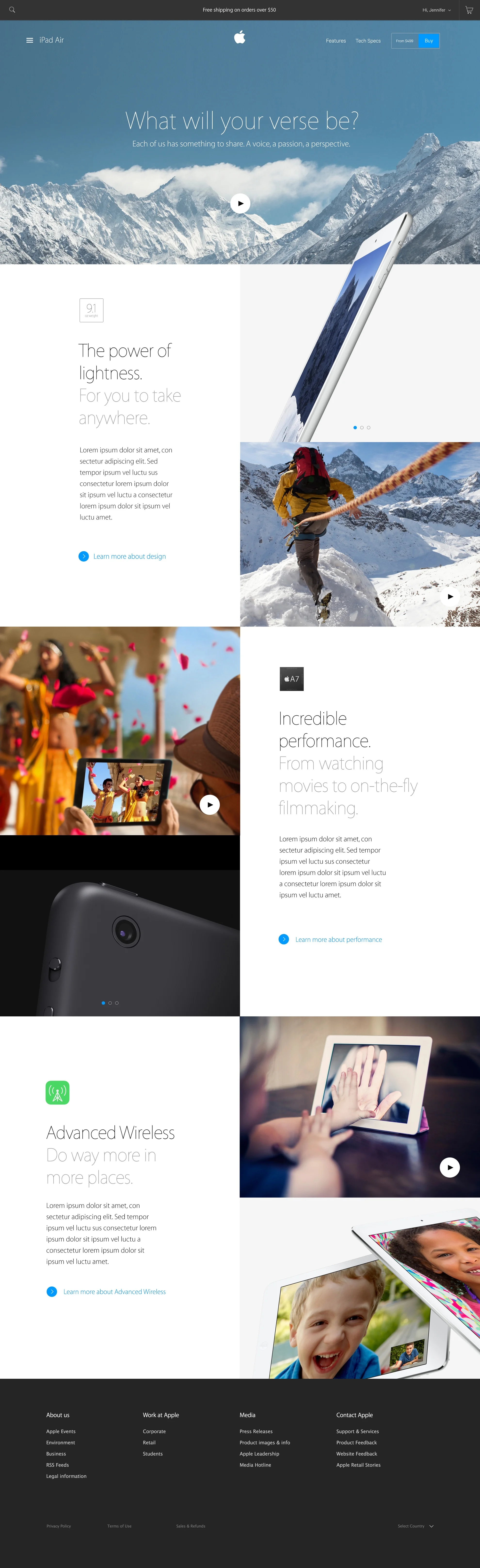
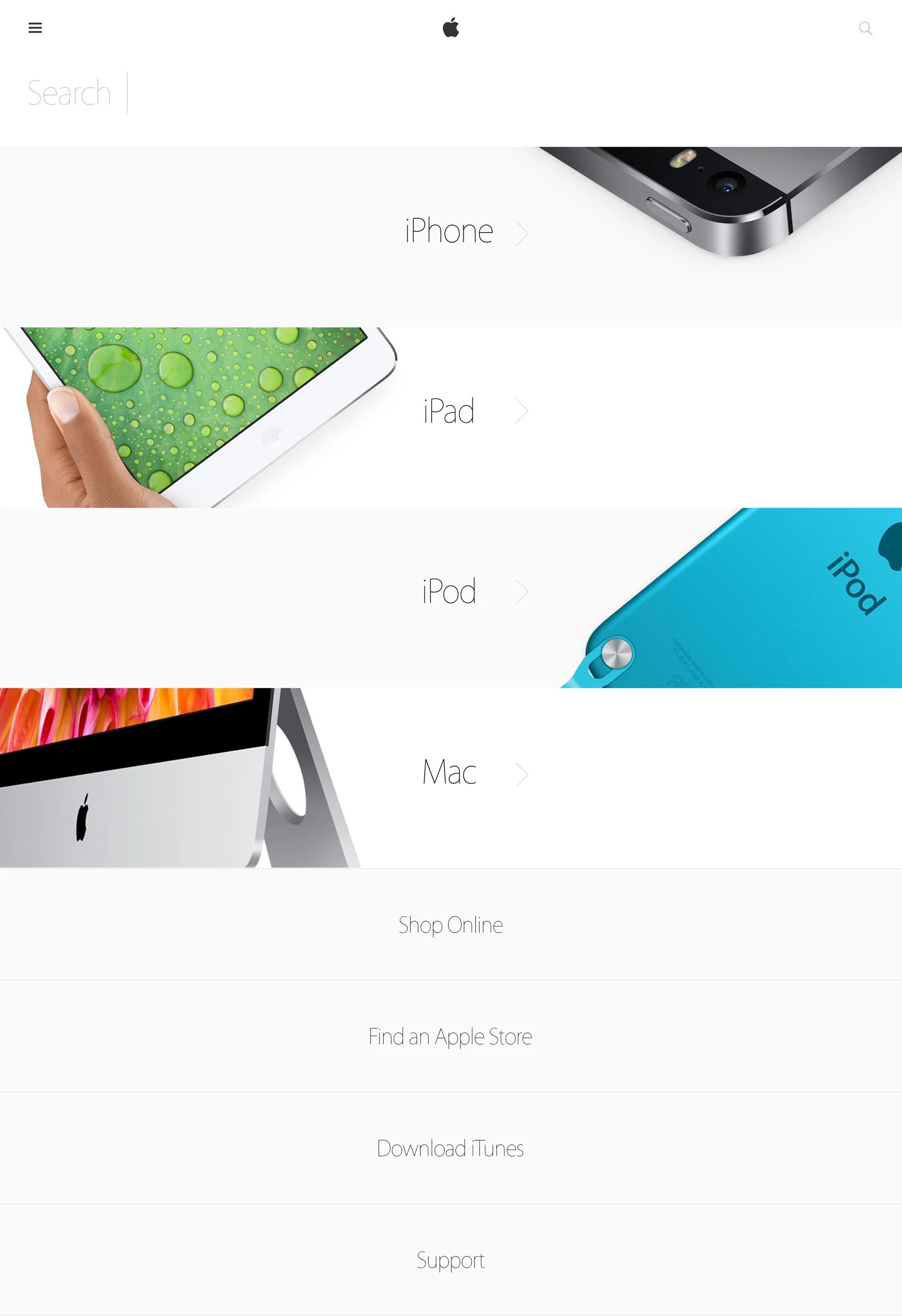
Direction 3: iOS
Based on the (at the time) soon-to-be-launched iOS 9, this design direction takes advantage of the bold iOS 9 design system and its purposeful blurred photo and video backgrounds as a way of layering content over it.
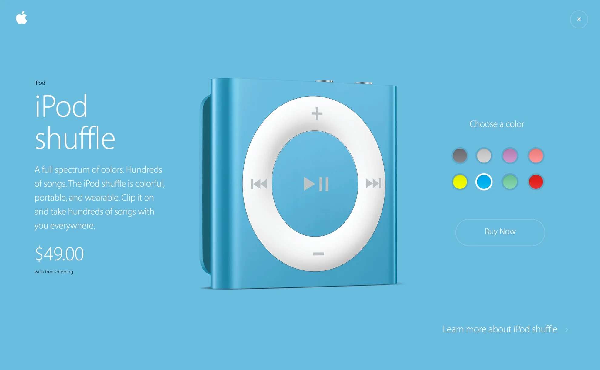
D4: Minimal
Following the design mantra less is more, our team explored how much we could strip things down but still keep the design elegant and on brand. Kenya Hara (MUJI) and Dieter Rams (Braun, Vitsoe) were some of the biggest influences for this design direction.
Style Guide
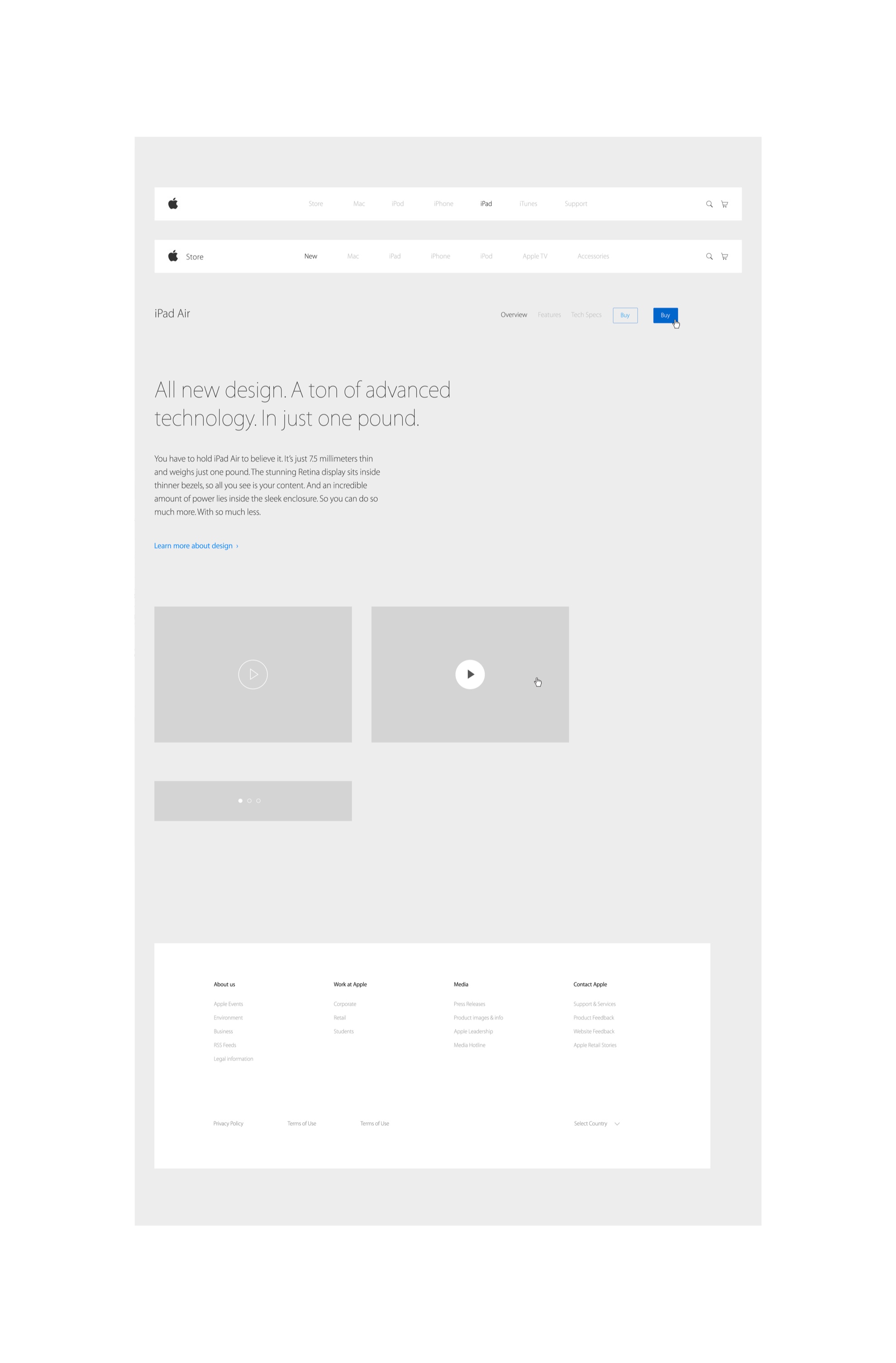
Part of our exploratory process was to also think of ways to systematize some of our design decisions so everything was not only thoughtful, but scalable and robust.
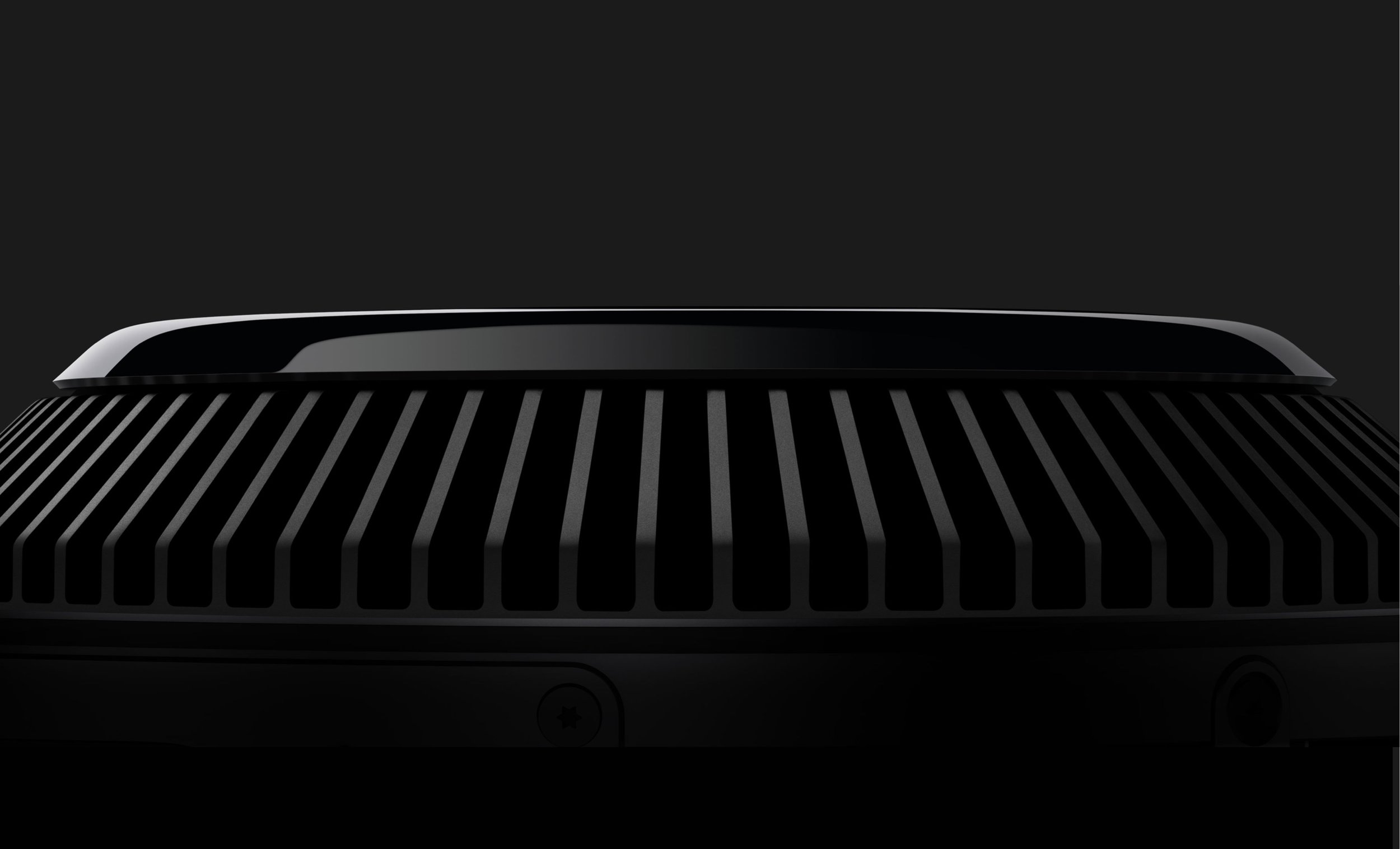
Explorations
With the task of exploring new concepts and styles, we created these fully black and white pages, blown out products, testimonials, campaigns, storytelling, uneven grids, and color blocks.

Reel
Reel video with a few fleshed out projects and some other experiments.
Creative Director: Casey Sheehan
Art Directors: Andre Felipe Ribeiro, Pawel Pietryka
Visual Designer: Johan Rundberg
UX Director: Jenn LaPlaca
UX Designers: Jennie Perri, Wes Michaels
Motion and UX: Ian Silva